
 Back to overview
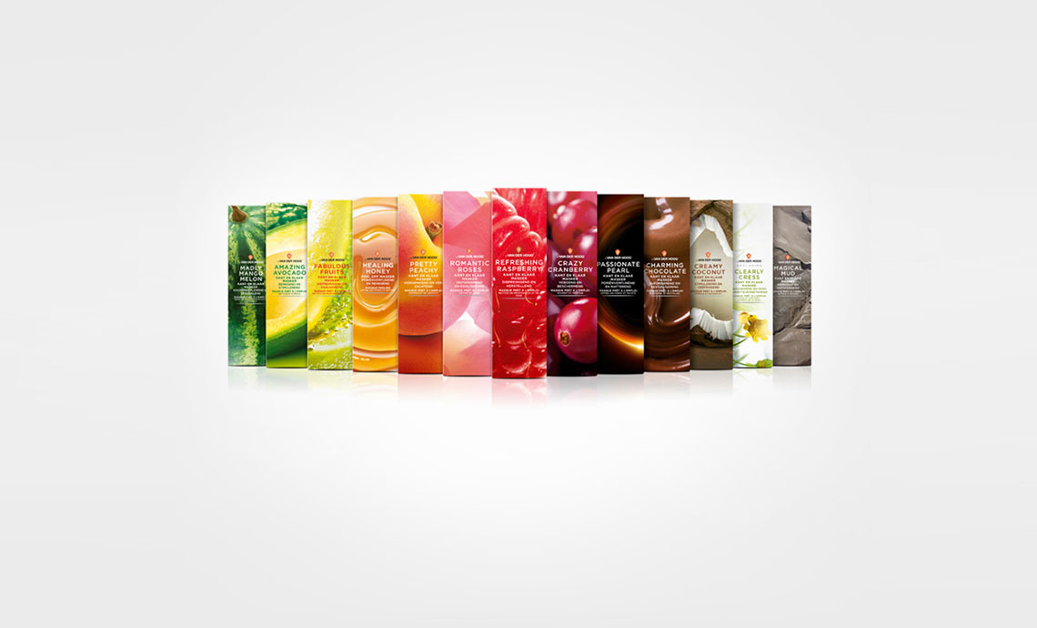
This outstanding piece of design was developed by our designer Joost, aided by Frits in retouche. below find the article and some of the comments.
Jordan Love the contrast between the boxes and the bottles. The typeface is great also! plumbing It's indeed a very creative product packaging. More buyers would be attracted by its alluring colors.
Reina_elliston These are indeed very refreshing to the eyes! I super love the raspberry photo. The movement of the water is impressive.
fred hart • Wow, big bold redesign. I commend Dr van der Hoog for taking such risks. Clients have a tendency to be overly protective of their brand, understandably, and it's refreshing to see a change like this.